[New] The Organiser is evolving
Published on January 6, 2023 by Laure
-
Updated on 14 mai 2024 à 12H01
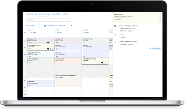
The Organiser has a new, more intuitive look for students, teachers and administrative staff.
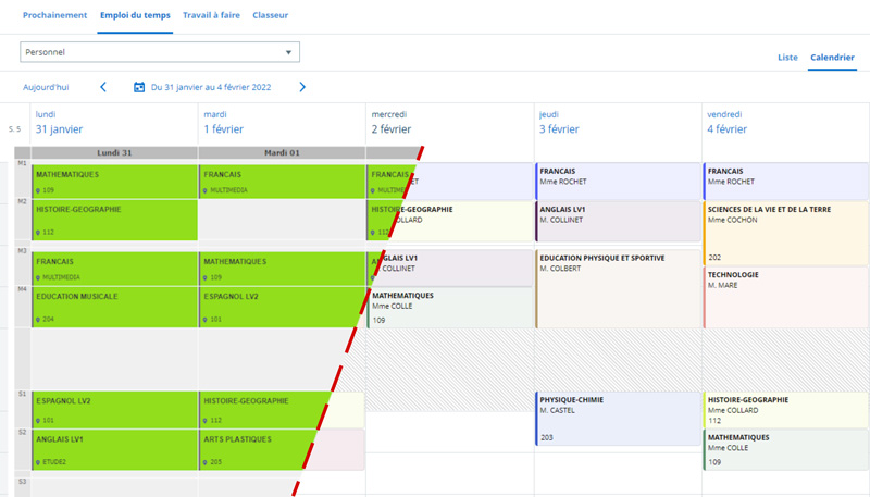
The right color for every Subject
From now on, each School can define the Timetable colors according to each Subject in the Students' Organiser.At a glance, students can find their next English or math Course(s).


Optimized navigation for Users
All key Course(s) info at a glance
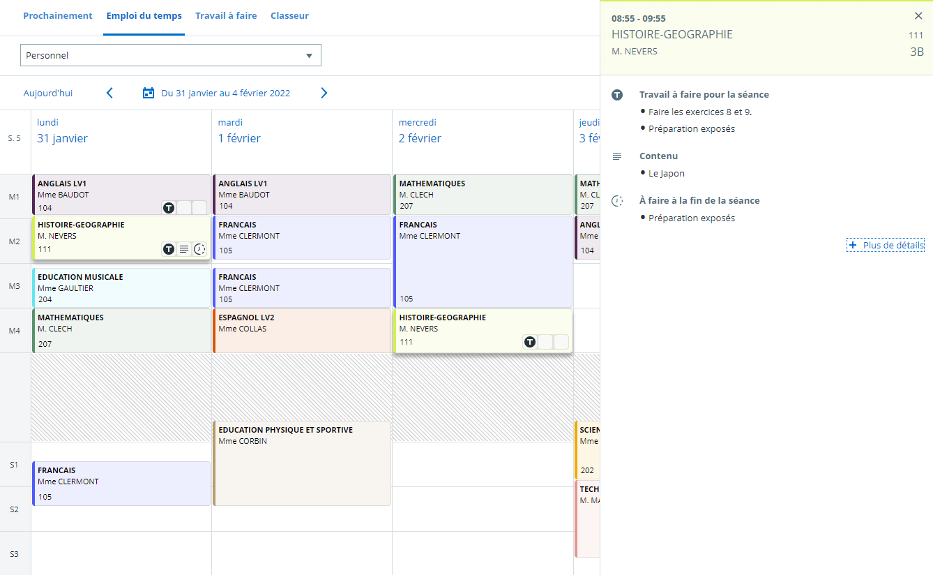
By clicking on the Course(s), students and teachers can view both the Work to do for that course in a new side window, and their Timetable. One click is all it takes to navigate from one Course(s) to the next. Teachers can choose whether or not to display content before the Lesson.

Student Course(s) details
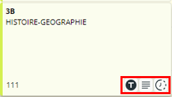
New pictograms for better organization
Pictograms help Students to see immediately in their Organiser if they have any work to do: in this case, the "T" pictogram is displayed at the bottom right of the course. They can also see if the course content is available with the "paragraph" pictogram, and if there is any work to do following the Lesson, the "clock" pictogram is displayed (see image below).
Deliver onSkolengo Academyto find out more about this development.

A time-saving side panel
Teachers can now modify their Course(s) content and Work to do directly from the Organiser calendar view.
In fact, a side panel appears when a Course(s) is selected, allowing the teacher to, for example :
In fact, a side panel appears when a Course(s) is selected, allowing the teacher to, for example :
- change the exercise title,
- add or delete an image or document,
- change the work to do after the Lesson,
- and much more ...
Keep up to date with all Skolengo news, subscribe to the Skolengo Newsletter.
Are you connected? Follow us on Twitter and LinkedIn

